Assignment 2: Storytime!
Introduction and Storyboard
For this assignment, I decided to make use of the several props (and clothes) I had lying around at home. This includes my sword and some clothes that I wouldn't usually wear out. Reading the assignment brief, I also wanted to make use of composition by arranging it in a comic-book style story. I came up with two storyboards that follow a similar theme of having a villain and a sword-wielding hero, who slices the villain in two. The slice breaks the fourth wall by also separating the villain's body into two panels.

This was my first idea. I ended up not using this.

I further fleshed out my second storyboard, which had a similar idea, but instead of slicing vertically in half, it's a decapitation.
Firstly, one of the important points is characterization. I have two distinct characters. The titular Gorillaman, a masked vigilante, and the Gangster.
For them to be distinguishable, I wanted to make use of Mise-en-scene extensively. For Gorillaman, I specified a dark costume with a dark background for him to be mysterious, like the Batman. If possible, I wanted light to reflect on the sword for contrast and draw attention to it. For the gangster, I gave him a costume. At first I gave him a suit, but then decided to instead draw him a jacket I had in my closet. I also laid out pipe, poker cards, and money. These are vices to make him seem more evil or corrupt. Also, I had in mind a little grimace (you can see in the drawing) which I felt was humorous but characteristic of gangsters.


Framing wise, I tried to use a variety of shots, such as a bird's eye, medium, or long shot for exposition. Examples are the overhead shot of the gambling table, and Gorillaman's first appearance.
Close-ups (and extreme close ups) were used for more tense scenes, like with Gorillaman creeping up or his sword being unsheathed. They were also used to show reactions and consequences, like the close up on the gangster's face, body, and hand. I tried to use low angles to demonstrate power levels as well, with Gorillaman being viewed from below, giving a sense of "creeping" and "doom".
There's also the concept of 180-rule, for the audience to be able to follow the story, I tried to make sure everything makes sense spatially. This means the characters should be facing appropriate directions, and their relative positions are never compromised.
The Photos
There were a few changes from the storyboard that I made while taking the photos due to logistical or framing issues. I did the assignment by myself and it was pretty hard taking photos with a timer and barely any proper equipment beyond a phone. I decided to go with a model gun instead of a knife for the gangster, as it's easier to show it half-exposed.
Using my camera's guidelines, I also tried to position myself and objects of interest following the rule of thirds.


I took two photos of this frame, facing left and right, in case I actually want to reorder my images and/or accidentally violate the 180-rule. Also, it was tough work maintaining this grimace but I think I pulled off the gangster look well.
For Gorillaman, it turns out my house did not have enough space for the framing I envisioned. I ended up using the dark hallway and door frame as an actual frame for Gorillaman. I enjoyed the contrast between the light room and dark hallway. Thanks to the light from my room, it was able to reflect off the sword and give the effect I wanted.


Although these two photos are very similar, I found them necessary as it created an appropriate bridge between the Gorillaman approaching and the Gangster being suspicious. It's thanks to the storyboard that I realised I needed the extra panel in between for the panels to move smoothly.
An effect I liked was the shadow of the doorframe creating a distinct line. In the first photo, Gorillaman is largely in the shadows, though his hand is in the light. This difference in lighting gives a strong sense of depth. In the second photo, you can see me positioning my feet, one on each side of the shadow, creating a bit of motion and approach, which is exactly what I wanted.

I found difficulty trying to simulate motion with this. I couldn't change the shutter speed of the front-facing camera. Otherwise, I like the low, dutch angle and composition of the sword going diagonally.

This was the hardest to take due to the angle, and my position in the photo, which made it hard to verify my pose.
The Assembly
Again, shoutout to file organization.

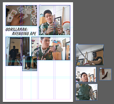
I used InDesign to arrange the photos. I first started with some rectangle frames (4:3, following the source ratio) and resized and arranged them around the A4 page, following the planned placement of my storyboard. I realised that it may be a little difficult to fit the photos nicely, even when I hadn't placed any images yet, because the position of the frames was enough. So, I created two InDesign files, one in portrait and one in landscape, to experiment further and see what works.


Once I had the frames roughly arranged, I shortlisted some photos and dragged them into the frames to see how they looked with respect to everything else. I was also able to drag the frames around, rotating them as need be, to create a more dynamic layout. InDesign is definitely the right tool for this.

This was what it looked like. On the right, are some shortlisted photos for ease of comparison.
There was a little deviation from my storyboard, but the concept remains: Break the fourth wall with decapitation. The two panels are crooked and out of place to give a little bit of dynamism, as if they've been tampered with. This gives the impression that it was the sword that sliced the panels into two, and them being rotated slightly gives a feeling of "off-balance" - in the case of the Gangster, he's been taken by surprise.
I really needed the last panel as a final beat, closing the story with the right tempo. Otherwise, it ends on a climax, which I don't want. The last panel and the limp hand implies the Gangster is dead. Period. End of story.
Additional Reflections + Scrapped photos
As I've mentioned, the "tempo" of the story is really important to me, especially for an action scene. I need a buildup of suspense along with a dynamic climax, followed by closure. So, it's not enough to tell a story. I need the photos to set the pace as well. That's why I kept panel 4.
Here are a selection of shortlisted photos that didn't quite make the cut in the end.

At first, this was to showcase the act of playing cards. However, my next panel was the gangster holding money. So, I couldn't use this as he went from holding cards to holding money. It's far too big a jump between panels. Instead, if he was holding the money, it still gives enough exposition that he's gambling.

Gorillaman is too bright now. He could be standing further back in the dark. This also looks less scary than intended.

This was an alternate ending photo, showing Gorillaman looking down at the victim (with a low angle camera). I didn't have enough panels to fit this in, and this pose was not as threatening as I planned... kinda looked like I was modelling my butt, so I scrapped it.

This was scrapped because my back foot wasn't in the darkness. My awkward pose was supposed to be me walking forward, giving some sense of motion, but it didn't make enough good use of depth and lighting.

This looked too much like the Gangster's POV when I intended it to be more neutral/Gorillaman's perspective. This was SO hard to get right due to the awkward angle I needed, plus my own positioning.
Post-Critique Edits
Before I made any changes, I decided I had to overhaul my composition to make better use of guides, i.e. having a more consistent margin and gutter (The space between panels), so it looks more like a comic book, and is overall neater. I set a margin of 2p and 4 columns with 1p gutter. I also set 4 rows, although I did not always have to strictly follow these guides. As I moved and resized my photo frames around, I moved the guides as well to maintain a 1p gutter. I duplicated the page for this.

I resized the frames to suit my needs. For example, panel 1 (Going from top-left) is landscape as it is a sort of establishing shot. The other panels were cropped and resized to maintain the rule of thirds in each panel. Panel 5 is a little more narrow to indicate the Gangster has his eyes focused on something! It also frames the gun very well.
Panels 3 and 4 were remarked by a classmate to be very appropriate, and I'm very happy to hear that. I really, really like the flow they produce.
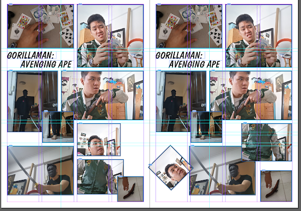
One of the more conflicting remarks I got in tutorial was regarding the position of the head and body, i.e. the CORE IDEA of my story. Everything else could remain the same, but I had to pay special attention to this. So, I duplicated the page to compare side by side. The two main comments were:
- make the head frame more attached to the body frame
- Or, put the head frame on the left, and the body frame on the right.
There was also an additional issue of how much I wanted to tilt the panels. Below are my thought processes:

This idea made good use of space as there was minimal white space. The head being slightly tilted and lower, against the body panel which is upright, suggests that the head has been sliced off and is animatedly "Sliding off" the body slowly.

This one, in contrast, appears more like the head has been sliced so forcefully it's been flung to the left, and might even fly out of the page. Of course, on the right, we're left with a staggering body which can't stand properly- as signalled by the tilted panel. I was hesistant to use this due to the positioning, with the body panel being relatively higher up. However, I kind of liked it, as there's no headspace above the body panel, and the head really does look like it's been flung away the way Gorillaman is positioned in between the two panels.
Of course, the last panel is a must. It ends the story on a beat. The gangster is dead. Well, that's it. I hope you enjoyed my story!

Nobody got hurt everything is protected and fine no hate speech no violence no bullying


Comments
Post a Comment