Assignment 1: Stripping Down!
Setup
In this assignment, I will be taking a photograph and abstracting it using Adobe Illustrator. First, I have setup the layout on InDesign, just to try using InDesign more. The requirement is for a landscape A4-size submission, but I found it hard to split into six equally spaced parts as the dimensions of A4 paper are not exactly easy to divide. So, I'll probably experiment more with this setting. Otherwise, what I have now is 6 almost-equally spaced boxes, with slightly more space in the bottom, which I may change, but I enjoy the asymmetry at the moment as the bottom-heavy look allows this document to have a distinct orientation, plus I can put the name and details there.
Abstraction 1
OK, Let's start! I'll be using the following image of a lunch I had during recess week. The plate was so comically large, I just had to take a photo (hand for scale).
In Adobe Illustrator, I have prepared my document. For my first abstraction, I'll just roughly trace the image. I create layers and lock the base image which I will be tracing over, so I do not accidentally move or select it.
I'm done with the chicken. I lock the chicken layer and create a new layer for each new element.
Some problems are present: The spaghetti was hard to trace using pen tool. Also, the cutlery, plate, and hand are obscured or cut off in my original image. I roughly estimated the fork's size and the plate's curvature. In later abstractions, I'll just draw them from scratch since I cannot trace them properly.
At this point I sort of regretted my choice of image, but I must simply press on. Here you can see my main regretti: Spaghetti, very hard to draw. Eventually, I scrapped it and used the blob brush instead of pen tool to draw it. I used the blob brush over the regular brush tool as I wanted it to be treated as one solid shape. I also added more details, shading, and colour. The result was more appetizing. It's originally cream-based spaghetti, but it's fine, I don't need that detail. They're all varying tints of Yellow and Black and White, but I'll try to reduce the need for colours.
Before I continue abstracting, I have a message I want to communicate with
this image, and that is
"Look at my meal, my plate of chicken and pasta is HUGE! Hand for
scale."
So, there are a few elements I need to maintain: The chicken and pasta, the
plate, and its size in comparison to my hand. This is also the reason why I
also included my hand in the drawing.
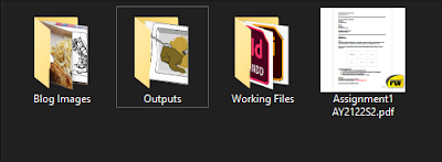
Also: A quick shout out to file
organization.
Abstraction 2
I figured the hand was recognisable enough without the need for colour, so I made it black and white. I simplified the plate but still kept the middle grey to signify depth. I cleaned up the spaghetti, and shifted elements around so that none are obscured. In the plate there's still a fork and spoon, and chicken and spaghetti.
Abstraction 3
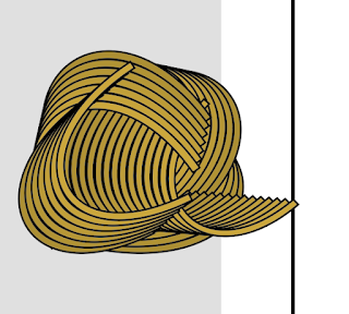
This one was a major roadblock because I wanted to abstract the pasta even further. The chicken was easy enough to break down into distinct, recognisable shapes (Wing, Thigh, Back), but the pasta.. Gosh! I tried a few things, including the Blend tool (Which is really neat, I found out about it online!). Here I experimented a few pasta shapes. Eventually, I ended up just using the curve pen tool and layering it with different shades of yellow.
I also decided to get rid of the warped perspective, and now everything is presented flat and upright. I didn't know where to place the fork and spoon, so I put them above the plate, mainly arranged for a neat parallel look.
The above 2 images show the before and after of the blend tool respectively. Illustrator fills in the gap between two selected shapes.
I did use the blend tool eventually, but not for Abstraction 3 after all.
Abstraction 4
I further distilled the chicken into a simplified but still recognisable shape. I used a combination of blend tool and clipping mask to layer the pattern of the pasta. As for the cutlery, I wanted to remove them as they were redundant. However, the inclusion of the fork was appropriate as pasta is usually depicted with a fork - so this helped convey the idea of pasta. I also drew a symbol-like hand to replace my own hand. This was done by using black shapes and merging them with pathfinder. It takes a while to understand what each pathfinder tool does, and I used them for the chicken and pasta as well. I considered a round plate, but I kept the square plate as that was part of the reason the plate was ridiculous.
As I abstracted further, it became harder to discern my message. I added the measurement lines as a way to stick to my original message of telling the viewer the size of the plate in comparison to my hand. This iteration is probably my favourite one, it's in a sweet spot of just enough abstraction. Plus, the pasta looks great. I finally figured a way to depict it nicely.
Final Abstraction
Finally, I further simplified all the possible elements. Again, the overall message is "This is a ridiculously large plate of chicken and spaghetti. Compare it to my hand." I hope I have achieved the purpose. This was a very fun exercise, and I used some Illustrator tools for the first time: Blob brush, Blend, and the various Pathfinder methods.
Post-Critique Edits
A quick showcase of my Adobe Illustrator file. I used different artboards and layers for each iteration. It helps to keep me organized.
Firstly, I got feedback that I should keep the spaghetti and fork, as the old final abstraction looked like a ball or a random pattern. I wholeheartedly agree with this and kept it in the final iteration. After trying so hard to make a good abstraction of spaghetti, I felt so PROUD to have something to show for it, so I should keep it.
Another very important comment I got was that the chicken portion was drastically changing each iteration! I also felt that way during the original process, but I felt that it was not the portion size that was important, but the fact that it was chicken. However, I have changed my mind, and decided to make it more representative of its portion (Half Spring Chicken) as that also adds to the message of "Big Portion!". The straight line down the middle abruptly cuts the curved chicken, and I think that really shows it's "Half".
I feel like if it can be abstracted without colours, it is more successful than having to rely on colours. Between my last two abstractions, I removed all colour. I think it still looks identifiable. Because it's all in black and white, I changed the fork and hand to black to contrast the amount of white. Plus, the black fork is more visible against the spaghetti.
Lastly, there were polarized opinions on whether I should keep the measurement lines. I tried looking at it without the lines, and experimenting with other ways to depict a size comparison. Ultimately, the lines are the cleaest way to do so, almost explicitly. I decided to err on the side of being explicitly clear on my message, instead of being more ambiguous if I do remove the lines.
That's it! I hope you've enjoyed following my process as much as I have.


Comments
Post a Comment