In-Lecture Exercise B
Apply constructive criticism model in evaluating a design or artwork.
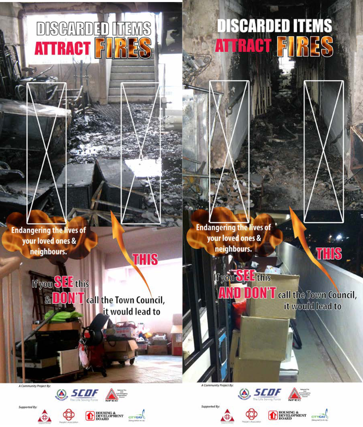
For this exercise, I have chosen the following design(s) which were part of an SCDF campaign to spread information about fire safety in HDBs. These specific designs were pasted on lift doors, with the white boxes representing the lift windows.
Applying the Constructive Criticism Model...
- Description:
- Analysis:
- Interpretation:
- Judgement:
Firstly, these posters make use of photographs of a cluttered and a burnt
corridor.
There are several text elements as well. Most prominently on top, in a large
and bold typeface, "DISCARDED ITEMS ATTRACT FIRES". In the bottom are
supplementary text in smaller size. The texts are in varying sizes and
colours, some with a fire pattern as well. There is an arrow leading from
the text to the top photo.
Lastly, the bottom of the posters contain the logos and information on the
stakeholders behind the project.
The photos being placed on top of each other create a cause-and-effect
relationship. The arrow and text elements also help to establish this,
implying that the cluttered corridor leads to the burnt corridor, due to
spread of fire.
With eye-grabbing photos, there is a need to make the text elements stand
out. This is probably why so many methods were used to place emphasis on the
text, including bolding, colouring the words red, or using a fire pattern.
was used.
The posters being featured on an unconventional medium, lift doors
specifically, is an appropriate choice as the target audience are residents
of HDBs, and they will view these posters on their way home, from then they
can take action after seeing the poster.
The bottom logos of the various agencies have no special designs to
distinguish themselves from the rest of the poster and to give a feeling of
authority.
The cause-and-effect arrangement effectively allows viewers to understand
how a common scenario can lead to something unforeseen like a fire. The
photos create a sense of guilt/fear in the viewer, pressuring them to abide
by fire safety regulations lest they end up like the above image. These
posters definitely place emphasis on prevention over cure, by sending a
strong, shocking message on the consequences, that is, uncontrollable fires.
The consequences are illustrated both in the pictures but also in text:
"Endangering the lives of your loved ones and neighbours." There is also a
clear course of action that the viewer can take, and that is to "call the
Town Council". Other viewers may also feel convinced to declutter their
corridors.
The logos of the relevant agencies give them a feeling of trustworthiness
and authority.
While I can say that this piece has some successes, it is not elegant at
conveying its message. To begin with its successes, I think it is an
appropriate choice of medium (Print on Lift door) for this ad, both for
comprehensibility and access to target audience due to its location. The use
of clear photographs and text also makes the posters easily understood.
There is also a clear call to action.
However, my main gripe with these posters is that the relationship between
the two photographs is hindered by their positioning. Normal readers read
from top to bottom, but these images are stacked in the reverse order, which
affects the flow of reading. It is essentially upside-down, which is why the
arrow is needed, although typically it should not be necessary.
Adding on to that, there is an excess of elements on the poster, making it cluttered, just like the photographs. There is too much text to read, and the different colours, sizes, and patterns add on to hinder visual clarity. There should not be so much use of emphasis like big red text in one poster. And worse, the wrong words are emphasized. "See", "And Don't", "This". It does not make much sense.
This poster could be marginally improved if the words "Call the Town Council" were the ones highlighted instead. Some text could be removed altogether, such as "Endangering..." as the threat of fires is usually well-known. Of course, the position of the photos could be swapped or even placed side by side, with half of each photo forming a whole. The text elements could be arranged better, not at random locations around the photos, and perhaps could use some white space around them to contrast against the photos, so that other forms of emphasis is not needed. Finally, I'm sure there are better fonts than Impoact...


Comments
Post a Comment